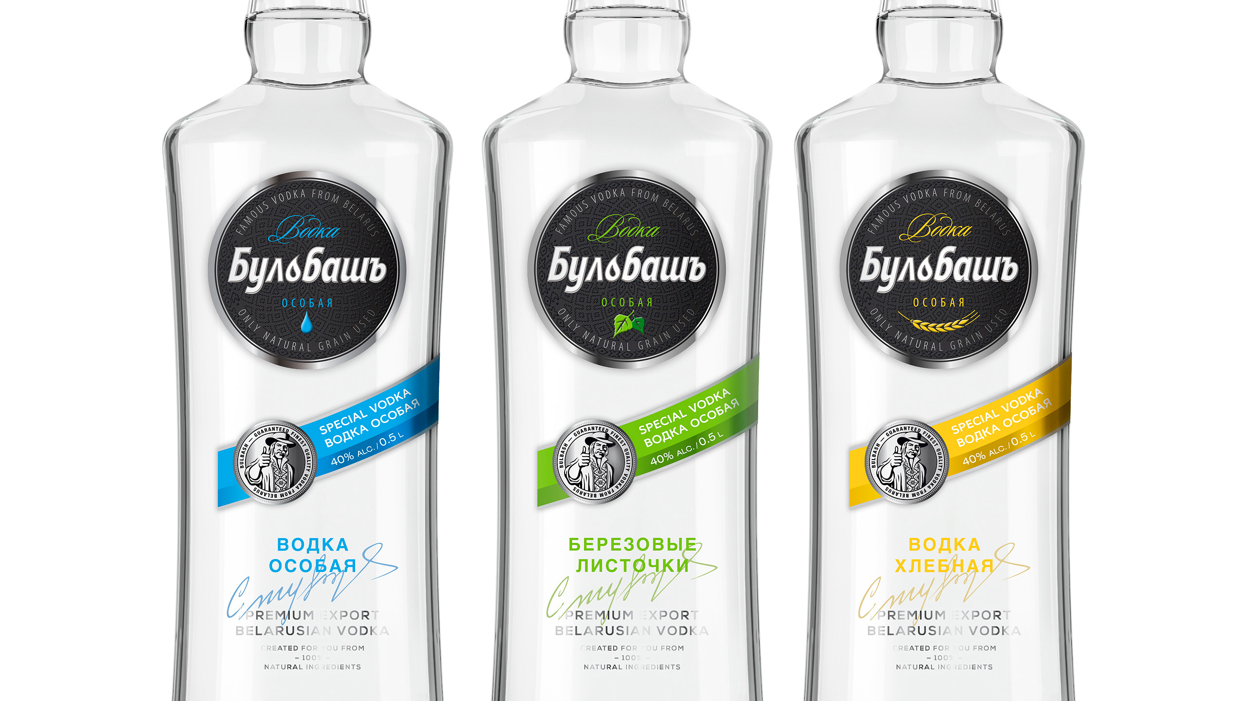
The most important thing when redesigning Bulbash vodkas was consistency: the brand is easily recognized by the audience, and the customer wanted to keep it up. We refined the well-known black circle: besides composition changes, we introduced glossy embossing in the form of Belarusian patterns, thus intensifying the brand’s cultural identity.
We also decorated the closure with traditional patterns. They look favorably on the shelf, protect from forgery and ensure traction. The label features the brand character and signature of person responsible for quality, while the embossing now lies horizontally, thus creating more space for labeling.
Bulbash now conforms to modern design trends, but still is easily recognizable on the shelf.
CUSTOMER: ZAVOD BULBASH OOO
